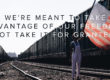
Got a few requests for the slide typography I talked about at my Echo session. So here you go, everyone!


Got a few requests for the slide typography I talked about at my Echo session. So here you go, everyone!
Jonathan Malm helps people uncover creative options for their life and their church. He’s the author of Created for More, a 30-day devotional to help you develop a more creative mind. You’ll find him in San Antonio, Texas, roasting his own coffee beans and enjoying life with his Argentine wife, Carolina.
Comments are closed.

This is AWESOME. Definitely going to try and use some of these ideas.
This is AWESOME. Definitely going to try and use some of these ideas.
Great. Beautiful. Thanks!
Great. Beautiful. Thanks!
Jonathan, these look great! I think it would be tough to use in some settings but this is some great inspiration!
Jonathan, these look great! I think it would be tough to use in some settings but this is some great inspiration!
Looks awesome! I like the progression down the screen on Oh Happy Day.
Looks awesome! I like the progression down the screen on Oh Happy Day.
Did you use these slides for corporate worship? They look great. On the other hand, it looks like you have to change the slides quickly and often.
I want to grow my perspective on this. Why did you make the slides like this instead of more words per screen? From your perspective and from what people say, are people able to follow this clearly? It just seems (to me) like it could be hard to follow.
It took some pretty amazing volunteers to make it happen. The volunteers did change them quickly…but they changed each slide before the last word was even sung. People have the ability to read ahead…so they don’t really need those last two or three words.
It can definitely cause stress for the singer if it’s not changed quickly enough…but it can also provide energy that matches the energy of the song when the screen has quick, punchy visuals. Plus, I’ve noticed you think about the words more when there isn’t a huge chunk of text on the screen.
It’s all about context. But it worked in our situation…and I wanted to provide this as a challenge for others to think outside the box for on-screen visuals. 🙂
Just as you’re challenging me to think about it more deeply. I appreciate it.
But what you say makes a lot of sense. If done right, it speaks loudly and clearly. And just because it seems impractical or hard to do doesn’t mean you don’t do it. It just means if you’re gonna do it, you do it hard and well.
Also interesting is the thought ‘you think more about the words when there isn’t a chunk of them on the screen.’ Is that a personal observation? Having less words would definitely help people focus more specifically on the only words present. But I wonder if the words are changing more often if that would work against the idea. More time with more words or less time with less words. As you said, I think context is an important aspect here.
It’s personal observation. At least with those particular songs.
And it’s not an all or nothing thing. Sometimes I do use big chunks of text. Especially if the songs have more theological depth that people might miss if it’s changing too quickly.
Again, very good points. You think what is best for each song to communicate it best for and to the people. Thank you for the ideas and sharing them with us. I’m definitely going to think about how to communicate more through slides than just block text and background images now.
Did you use a specific program to make them in a presentation software, or did you simply make images of the whole slide and import them in?
This was one of those things that after I read it I thought to myself “why didn’t I ever think of that before?” Needless to say I tried it right away for a new song we were doing “Bones” by Hillsong United.
http://s1115.photobucket.com/albums/k549/ryanbrien/?action=view¤t=Bonestypography.jpg
Looks good! 🙂
These are stunning!
These are stunning!
I love them – really making me think how I can do more interesting things with my church.
I love them – really making me think how I can do more interesting things with my church.
are these available for download anywhere?
HI Loren. Sorry to say they aren’t. But you could easily recreate them with the right video files. Would it be helpful for me to link those up to where you can purchase/download them?
are these available for download anywhere?
HI Loren. Sorry to say they aren’t. But you could easily recreate them with the right video files. Would it be helpful for me to link those up to where you can purchase/download them?
theres no images anymore…
Eek. Thanks for catching that. I’ll email you the images personally and try to fix this post. 🙂